dpiスケーリングの憂鬱
2016年から難航しているdpiスケーリングの憂鬱。
 |
| https://www.quirksmode.org/m/tests/widthtest.html |
例えばQuirksMode:Screen size testsで調べてみると、Windowsデスクトップ(WUXGA:1920×1200)だと
screen.width/height = 1920 / 1200であるのに、Nexus 5(FHD:1080×1920)だと
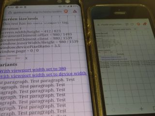
documentElement.offset = 1226 / 600
documentElement.client = 1226 / 887
window.innerWidth/Height = 1226 / 887
window.devicePixelRatio = 1
window.page = 0 / 0
screen.width/height = 360 / 640となるので、文章はそれなりの大きさで表示は収まるものの「横幅は360px」なので「width=320px」の画像が横いっぱいに表示されるなんとも不細工な結果になっていた。
documentElement.offset = 980 / 1334
documentElement.client = 980 / 1393
window.innerWidth/Height = 980 / 1394
window.devicePixelRatio = 3
window.page = 0 / 0
screen.width/height = 1536 / 864となり、スマホに限らない根本的な問題であることに気付いた。
documentElement.offset = 1114 / 600
documentElement.client = 1114 / 682
window.innerWidth/Height = 1114 / 682
window.devicePixelRatio = 1.25
window.page = 0 / 0
【参照】
●Re Simple inc.(リシンプル) https://www.re-simpleinc.com/
┗スマートフォンに対応するViewport設定について 2015年10月15日
●ichimaruni-design https://ichimaruni-design.com/
┗viewportの指定はどうするのが適切なのかいろいろ検証してみた 2015年1月16日
●Qiita https://qiita.com/
┣iPhone/iPad解像度(画面サイズ)早見表 2015年5月8日
┣iPhone6の時代のviewport設定について 2015年5月8日
┗もう逃げない。HTMLのviewportをちゃんと理解する 2016年2月27日
●Rriver https://parashuto.com/rriver/
┣気になるサイズの話 – px pt dpi 2010年8月3日
┣Media Queriesの基本についてまとめてみた 2011年5月9日
┣いまさら聞けないRetina対応のための「ピクセル」の話 2013年4月1日
┗もう、レスポンシブでいいんじゃない? 2016年11月17日
●QuirksMode - for all your browser quirks https://www.quirksmode.org/
┗Screen size tests
●田中達彦のブログ https://docs.microsoft.com/ja-jp/archive/blogs/ttanaka/
┣アプリの高DPI(High DPI)対応について 第1回 ~ 高DPIとは ~ 2014年7月16日
┣アプリの高DPI(High DPI)対応について 第2回 ~ アプリケーションの高DPIへの対応レベル ~ 2014年7月24日
┣アプリの高DPI(High DPI)対応について 第3回 ~ マニフェストでアプリのDPI対応レベルを変更する ~ 2014年8月22日
┗アプリの高DPI(High DPI)対応について 第4回 ~ 高DPIへの対応例 : Windowsストアアプリの対応方法 ~ 2014年9月3日
●Mozilla Developer Network https://developer.mozilla.org/ja/
┣ウェブデベロッパーガイド
┣メディアクエリ
┣Web API インターフェイス
┗Window.devicePixelRatio
●Wikipedia https://ja.wikipedia.org/wiki/
┣ピクセル
┣解像度
┗Retinaディスプレイ