dpiスケーリングの憂鬱
2016年から難航しているdpiスケーリングの憂鬱。
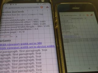
例えばQuirksMode:Screen size testsで調べてみると、Windowsデスクトップ(WUXGA:1920×1200)だと
screen.width/height = 1920 / 1200 documentElement.offset = 1226 / 600 documentElement.client = 1226 / 887 window.innerWidth/Height = 1226 / 887 window.devicePixelRatio = 1 window.page = 0 / 0
であるのに、Nexus 5(FHD:1080×1920)だと
screen.width/height = 360 / 640 documentElement.offset = 980 / 1334 documentElement.client = 980 / 1393 window.innerWidth/Height = 980 / 1394 window.devicePixelRatio = 3 window.page = 0 / 0
となるので、文章はそれなりの大きさで表示は収まるものの「横幅は360px」なので「width=320px」の画像が横いっぱいに表示されるなんとも不細工な結果になっていた。
screen.width/height = 1536 / 864 documentElement.offset = 1114 / 600 documentElement.client = 1114 / 682 window.innerWidth/Height = 1114 / 682 window.devicePixelRatio = 1.25 window.page = 0 / 0